Burberry’s commissioned St Edmundsbury Weavers to design and weave cotton linings for raincoats, but as costs rose it was no longer viable to weave them on hand looms and the firm switched to power looms. I have conjectured that Edmund may have also designed the Burberry label which depicts a mounted knight. This was registered world-wide as a trade mark in 1909. The image symbolised honourable dealing by the code of chivalric knighthood and protection by both the armour and the knight’s lance which also serves to carry the pennant. The word ‘Prorsum’ in the logo is from heraldic Latin and translating as ‘onward’ represents progress in manufacture and invention. There were a number of variations of the Prorsum logo over time, mainly to do with whether the name ‘Burberry’ is above or below the figure, and the font used for the name.** Edmunds’s hand is discernible in the medieval image and latin byword.
In the 1920’s the firm wove upholstery fabric for Gordon Russell, the Cotswold based furniture designer. Cotton damask tablecloths, bedspreads, dress fabrics and silk scarves were woven for Liberty’s and in 1927 book covers for a limited edition of Shakespeare, published by the Nonesuch Press were produced in cotton and worsted damask*. The Silk Journal of that year also reported on the success in America of the square gentleman’s mufflers with designs of the zodiac, Morris dancers and Egyptian figures that were being produced, illustrating the article with one example from The St Edmundsbury Weavers.****
The company were also listed as being a manufacturer of banners. In The Garden City Collection Study Centre, Letchworth, there are appliqué banners produced for pageants and events. In 1907 Edmund designed and made an elaborate appliqué banner for the Bury St Edmunds pageant and another for the Letchworth pageant of 1909, first used in their May Day celebrations. It became a regular feature in processions, celebrations and events. Called Four Square Our City, the idea for the design was inspired by Henry Brian Binns’s poem The Building, published in The City magazine in 1909. Edmund would have been familiar with the appliqué work of Godfrey Blount when they both lived in Haslemere and probably imitated the method Blount was well established in the town designing peasant art embroideries and linen appliqué, often for banners.
Edmund designed the majority of fabrics for the company and with his personal interests were echoed in his fabric designs: heraldry, theosophy, tarot cards, Persian art, animals, birds and flowers. Alec Hunter later remarked that his father produced the designs which interested him and then attempted to sell them. Alec had been designing while still at school and in 1919 joined the company introducing an Art Deco style. Alec’s own designs often featured ships and Morris dancers. He was a founder member, with his wife Margaret, of the Letchworth Morris dancers. Religious images appeared regularly with a number of textiles were designed for churches. The Letchworth Garden City Collection Study Centre show examples from all these themes.
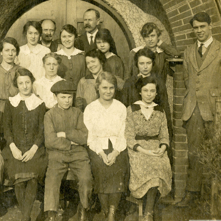
Edmund with Dorothea partlally hidden
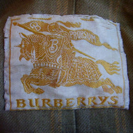
Prossum label
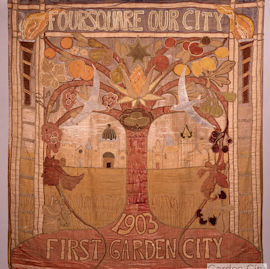
Letchworth Town Banner
All images and text © meg-andrews.com 2021